
COMPANY
Matter Motor Works
SCOPE
An ecosystem of Matter's Internal Operations (I covered Sales Module in this case study)
TIMELINE
8 to 9 months
TEAM
2 Designers, 1 engineer, 1 QA and 1 Manager
Project Details
Sales operations at Matter generate large volumes of data across multiple touchpoints—lead intake, lead quality, ETBR (conversion reports), dealership performance, sales metrics, and customer feedback.
This data needs to be monitored and acted upon by multiple stakeholders across dealerships and OEM levels, each requiring different levels of visibility and control.
To enable efficient decision-making, a unified and role-based dashboard system was required to consolidate data across channels and present it in a structured, actionable format.
Lead Generation to Lead Analyses
D-SUITE
Gather data from Sales Module of D-suite
MATTER ORBIT DASHBOARD
Outputs it in the form of meaningful analytics, shown via dashboards
Problem Statement
DOCUMENTATION CHALLENGED
The requirement for extensive documentation poses a barrier for rural customers who often face difficulties in gathering and submitting paperwork.
LIMITED INFORMATION
Many eligible customers lack access to comprehensive information about RPL, hindering their awareness and understanding of the loan offering.
ACCESSIBILITY CONCERNS
Rural customers often struggle to physically visit BFL branches, limiting their access to loan application assistance and creating a need for a more accessible solution.

The Beginning : Design Process
Business Goals - Marketing & Sales
MARKETING GOALS
1. Analyse lead/customer demographic data
2. Region/location from which most of the enquiries are being generated.
3. Source of enquiry generation
SALES GOALS
1. Lead drop-off point and reason
2. Dealership wise retail conversion rate
3. Test Ride conversion
4. Target completion analyses
5. Reviewing pending or over-due activities
Stakeholder Ecosystem
The lead analytics dashboards were designed for a three tier audience: Area Sales Managers, Zonal Managers, and the Sales Head, each needing a different lens on the same underlying data. Area Sales Managers required granular, dealership level visibility, tracking follow-up SLAs and response times, test ride bookings, and quotation status to manage day to day lead movement. Zonal Managers needed a rolled up view across multiple dealerships, comparing conversion rates and funnel stage drop-offs to identify regional trends and underperforming pockets. The Sales Head, in turn, needed a high level, decision ready view combining lead source breakdown with overall funnel health and conversion trends across the entire network. Designing for this hierarchy meant building a single dashboard framework that could flex in depth and granularity depending on who was viewing it, rather than creating three disconnected tools for the same underlying data. This shifted decision making across the sales hierarchy from delayed, report based reviews to real time, self serve insight, letting each stakeholder act on data at the pace their role actually demanded.

Wireframes : Built with Intention



Key Decisions
1. Role based views instead of one dashboard for everyone. I designed a different view for each role. Area Sales Managers saw dealership level detail. The Sales Head saw network wide trends. This meant no one had to dig through information that wasn't relevant to them.
2. Showing key numbers first, details on demand. Since there was a lot of data (SLAs, conversion, funnel stages, lead sources), I kept the main view simple, with high level numbers visible right away. Stakeholders could click deeper only when they needed more detail.
3. Same data, different framing. I kept the underlying numbers consistent across all three dashboards. Only the level of detail and visual framing changed by role. This kept the data trustworthy and easy to compare across levels.
4. Making follow-up delays visible early. I made sure SLA breaches and slow response times showed up clearly on the dashboard, instead of being buried in a report. This helped managers catch problems early, not just review them after the fact.
5. Using funnels instead of plain tables. For conversion and drop-off data, I used funnel charts instead of tables. This made it easier for Zonal Managers to quickly see where leads were dropping off, not just how many.
Outcome : Lead Ananlysis
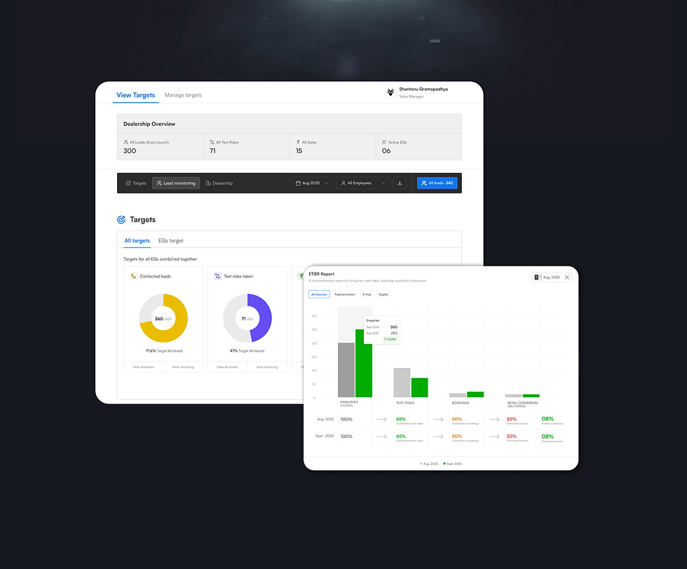
The target was to give each level of the sales hierarchy, from Area Sales Managers to the Sales Head, direct access to the data relevant to their role, so they could spot problems and act on them as they happened, not after the fact. Ultimately, the aim was to shift the sales organization from reactive reporting to proactive, data driven decision making.

_gif.gif)




Three unknowns, one launch. We were building a greenfield tool, no prior version to iterate on, no existing patterns to inherit. The users using it were selling a product (an EV) that most customers had never owned, using a
Three unknowns, one launch. We were building a greenfield tool, no prior version to iterate on, no existing patterns to inherit. The users using it were selling a product (an EV) that most customers had never owned, using a
Three unknowns, one launch. We were building a greenfield tool, no prior version to iterate on, no existing patterns to inherit. The users using it were selling a product (an EV) that most customers had never owned, using a
Three unknowns, one launch. We were building a greenfield tool, no prior version to iterate on, no existing patterns to inherit. The users using it were selling a product (an EV) that most customers had never owned, using a
Three unknowns, one launch. We were building a greenfield tool, no prior version to iterate on, no existing patterns to inherit. The users using it were selling a product (an EV) that most customers had never owned, using a
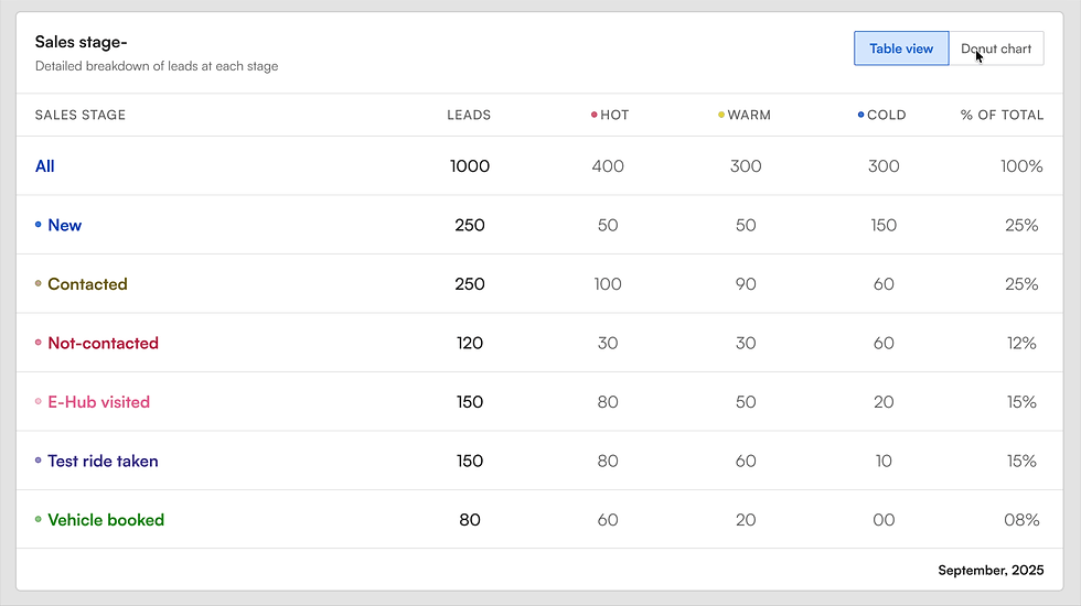
The dashboard represented the sales pipeline as a series of clear stages, from lead capture through to test ride, quotation, and final conversion, so managers could see exactly where each lead stood at a glance instead of digging through raw records. Within this pipeline, leads were further bifurcated by intent into hot, warm, and cold categories, based on behavioral signals like response time, test ride bookings, and quotation engagement. This bifurcation mattered because not all leads at the same pipeline stage carried the same urgency. A lead that had taken a test ride and responded quickly was flagged hot and needed immediate follow-up, while a cold lead at the same stage could wait. Representing both the stage and the intent level together gave managers a two dimensional view of the pipeline, helping them prioritize effort where it was most likely to convert, rather than treating every lead in a stage as equally important.
The dashboard visualized the sales funnel through the ETBR framework, Enquiry, Test Ride, Booking, and Retail, representing the actual journey a customer takes from first interest to final purchase. Each stage was shown as a distinct step in the funnel, allowing managers to instantly see not just how many leads existed, but how many were successfully moving from one stage to the next. This made drop-off points immediately visible. For instance, a high number of enquiries but a low number of test rides signaled a conversion issue early in the funnel, while strong test ride numbers with weak booking conversion pointed to a different problem further downstream.
SALES STAGE ANALYSIS
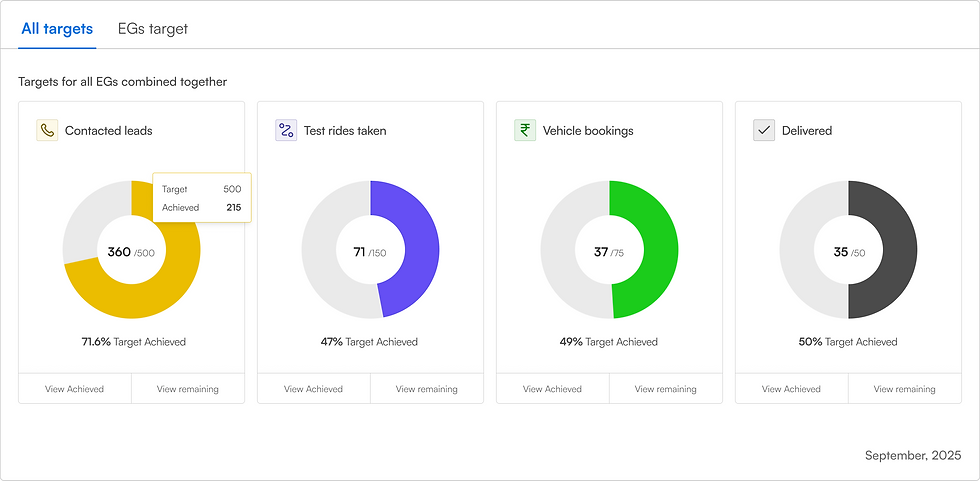
TARGETS
ETBR PIPELINE
The leaderboard ranked Experience Guides based on their target achievement, giving both individual EGs and their managers a clear, at a glance view of performance across the team.
LEADERBOARD
The target was to give each level of the sales hierarchy, from Area Sales Managers to the Sales Head, direct access to the data relevant to their role, so they could spot problems and act on them as they happened, not after the fact. Ultimately, the aim was to shift the sales organization from reactive reporting to proactive, data driven decision making.
Targets
The dashboard represented the sales pipeline as a series of clear stages, from lead capture through to test ride, quotation, and final conversion, so managers could see exactly where each lead stood at a glance instead of digging through raw records. Within this pipeline, leads were further bifurcated by intent into hot, warm, and cold categories, based on behavioral signals like response time, test ride bookings, and quotation engagement. This bifurcation mattered because not all leads at the same pipeline stage carried the same urgency. A lead that had taken a test ride and responded quickly was flagged hot and needed immediate follow-up, while a cold lead at the same stage could wait. Representing both the stage and the intent level together gave managers a two dimensional view of the pipeline, helping them prioritize effort where it was most likely to convert, rather than treating every lead in a stage as equally important.
Sales Stage Analysis
The dashboard visualized the sales funnel through the ETBR framework, Enquiry, Test Ride, Booking, and Retail, representing the actual journey a customer takes from first interest to final purchase. Each stage was shown as a distinct step in the funnel, allowing managers to instantly see not just how many leads existed, but how many were successfully moving from one stage to the next. This made drop-off points immediately visible. For instance, a high number of enquiries but a low number of test rides signaled a conversion issue early in the funnel, while strong test ride numbers with weak booking conversion pointed to a different problem further downstream.
ETBR Pipeline
The leaderboard ranked Experience Guides based on their target achievement, giving both individual EGs and their managers a clear, at a glance view of performance across the team.
Leaderboard
What I Learned as a Designer
In the end : When I finally look back
-
Designing for hierarchy, not just users. Learned that different stakeholders at different levels need different depths of the same data, not separate products entirely.
-
Data needs framing, not just display. Realized that showing numbers isn't enough. How you frame them, like a funnel versus a table, or hot versus cold, determines whether people can actually act on them.
-
Consistency builds trust. Learned that keeping the underlying data model consistent across views, even when the visualization changes, is what makes people trust the numbers enough to act on them.
Let's Work
Together
jayashreedhamijaux.online
jayashree676@gmail.com
Bangalore.
Home
About me
Contact
© 2026 by Jayashree Dhamija